Friday, May 29, 2009

What a Pear!

Mandee and Sean came to us months ago to design their save the dates, which included a wonderful shot from their engagement session with our fav photog - Jen Lowe.

We were so excited to take on their "pear-pair" themed invitation, too. With the pretty meadow green metallic pocket and espresso accents, the pear monogram design on the front really pops! I have to say that this is a fav in the studio right now. We love new colors and designs! Enjoy!

Thursday, May 28, 2009

...E Vissero Felici E Contenti

In Italian this means....and they lived happily ever after.

We thought this quote was appropriate given the beautiful pocketfold invitation we just finished for Maria & Christopher. This amazing couple are set to be married in Italy at the end of September. Maria worked with us over email to create their beautiful "Italian Tuscany" invitation. On this pocketfold invite we used a chili colored pocket, antique gold ribbon corners, an antique gold metallic backing and matching antique gold envelopes. Enjoy!


Wednesday, May 27, 2009

Showers and Stuff

While weddings are near and dear to our hearts, we also love doing invitations and other stationery for babies, sweet sixteens, corporate events and...yes, bridal showers too! We've been doing a lot of these recently, so I thought I'd give you a peek at the "not-so-wedding" stuff! Enjoy!
Baby shower invite in greens and yellows -- complete with adorable snails!
Sweet sixteen invite with pink and chocolote polka dot design
Pocketfold for corporate event on yacht...come sail away!
Bridal shower invite with a pretty paper band

Tuesday, May 26, 2009

Three B's Invite

What's with the blog post title? Well, the invite is blue, brown and for a wedding at the Bellagio! Jaimie and A.J. are having a destination wedding in Las Vegas this summer...how lucky! :) They wanted the pocket invite, so they could include a lot of those little details for travel, weekend events and how their guests can watch their wedding on-line, if they can't make the trip to Vegas. So cool! Enjoy!

Wednesday, May 20, 2009

Fan-tastic!

With all of the summer weddings coming up, we are making a lot of fan programs. These are just perfect for outdoor weddings when you are worried about your guests melting in the sun and humidity during your wedding ceremony. Your ceremony details go on the front, wedding party and thank you on the back, complete with middle cardstock color and ribbon bow on the wooden fan handle. Enjoy!

Monday, May 18, 2009

Starfish...Holding Hands

I just love this invitation design. I originally used the "starfish holding hands" a year or so ago for a bride and groom getting married in North Carolina on the beach. Kelly saw them and loved them too! With her cornflower blue, light lime and white color scheme, the starfish rounded out the definite summer, beach theme. Perfect for a wedding at Chesapeake Bay Beach Club! Enjoy!

Friday, May 15, 2009

Fit to a Tea

Julie and Matt came to us a few months ago to create their save the date and invitation. Some of you may remember her "z-fold" (accordian style) save the date. That was definitely a trend setter for us...we've done the similar save the date design many times since theirs!

So, onto their invitation...which is a tea-length (hence the blog title)...with celery backing and ivory top layer. We incorporated chocolate text, a pretty pink satin ribbon band at the top, along with a new monogram design. Love these colors and how everything came together...including the matching response card. Enjoy!

Wednesday, May 13, 2009

Classic and Fun!

So, Colleen and Andrew got married this past weekend. We had the pleasure of doing their save the dates, wedding invitations, along with their programs, place cards and table numbers. Below is a picture of their classic, ivory, folder style program.

The fun part of this post is the custom wedding card that Colleen's brother asked us to design for Colleen and Andrew. We just loved his idea of telling their "story", complete with pictures. So, we inlcuded the skyline of Baltimore and art that helped illustrate the story. What a unique idea! Enjoy!

Monday, May 11, 2009

I Scream...You Scream....

...we all scream, "Summer!" From the lemonade colored pocket to the turquoise accents, this invitation just makes you think of bright sun and cool water. Sarah and Matt live in South Carolina and both love the beach, water and sun. They really wanted an invitation that reflected them and this has to be it! Enjoy!

Thursday, May 7, 2009

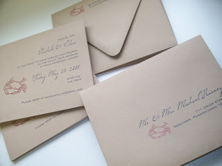
Maryland is for....Crabs!

Nichole and Chris are having a fun and totally Maryland rehearsal dinner...a crab feast! I just love these invitations. What better way to invite your guests than with a kraft card (reminiscent of those large rolls of brown paper at every good crab place) complete with crab artwork. It just makes me think of summer, Old Bay and the water. Enjoy!

Wednesday, May 6, 2009

Nautical Notions

Liz and Jason are getting married on a yacht and having their reception at the Annapolis Marriott Waterfront, so it is only fitting that their invitation incorporate a nautical compass! Combine that nautical element with the sapphire metallic pocket, silver accents and blue text and it's a completely Annapolitan invite. Enjoy!

Monday, May 4, 2009

White, Pink and Pretty!

So, I blogged about accessories yesterday and have some more to share with you today! Jamie and Nick were married this past weekend and came to us for a variety of "stuff" for their big day. Their raspberry pink and white color scheme is near and dear to our hearts, so we just love how everything turned out. Here are some pictures! Enjoy!
Our signature favor box with raspberry satin ribbon band and monogram tag on top; these boxes are filled with DeLoache Chocoalte truffles...yum! (www.deloachechocolate.com)
Square menus with white linen backing, raspberry pearl middle layer and white pearl top layer
New place card design -- tent style with raspberry pearl inset panel and place card tied onto tent card with white satin ribbon knot.
Our fav new table number design -- a raspberry pearl tent with white pearl inset panel and with satin ribbon knot at the top! Too cute!

Sunday, May 3, 2009

An Accent on Accessories

Angela and James came to me a couple months before their wedding in need of accessories -- rehearsal dinner invitations, table numbers, place cards and programs. Their wedding at the Annapolis Marriott Waterfront was so pretty...I had a sneak peak at the pics from Egomedia Photography (http://www.egomediaphotography.com/) ...and can't wait to see all of their photos! Below is a pic we took, in house, of their table number and place card. Enjoy!

Friday, May 1, 2009

Champagne on Ice

Kelly and David loved the vintage swirls design for their invitation -- our most popular! But, they strayed from others and used a different custom monogram design for the front of their pocket. I love the champagne, ivory and ice blue colors of this invitation. So pretty! Enjoy!